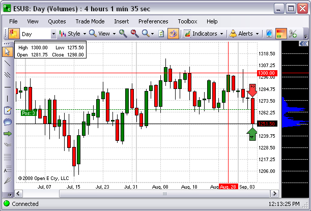
To display the histogram on the right side of the chart, click the histogram icon. Refer to the Figures below.
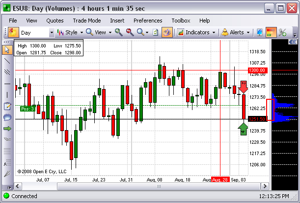
To resize the histogram window, place the cursor in the vertical bar between the histogram and the chart area. Refer to the black arrow in the lower Figure below.
To display the Chart Properties panel in the open chart, select Preferences and click on Current Profile.
On the Chart Properties panel, scroll down the list to select a particular folder. Refer to the Figure below.
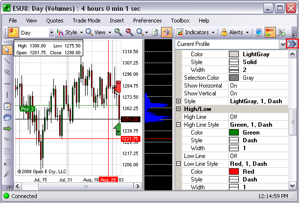
To close the Chart Properties window, click on the double arrows in the upper right corner of the window.