To display the drop-down menu of standard Drawing Tools, click on the icon.
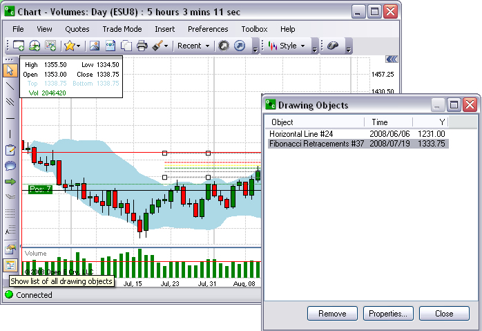
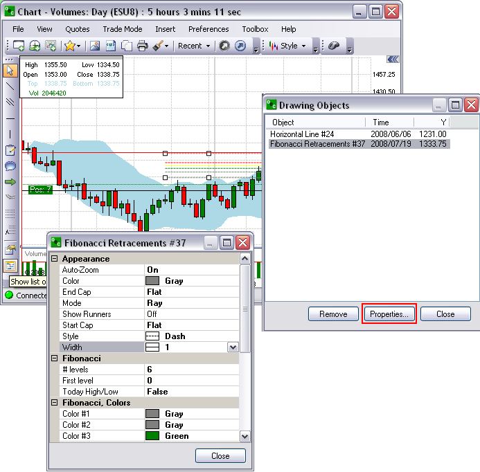
Show Objects List
This is a command (icon) that displays the Drawing Objects window.
To remove a specific object from the list, highlight it with the cursor and click Remove.
Edit the Drawing Objects List
To edit the properties on the chart, select the object and click Properties to display the Drawing Tool Properties window. Refer to the Figures below.
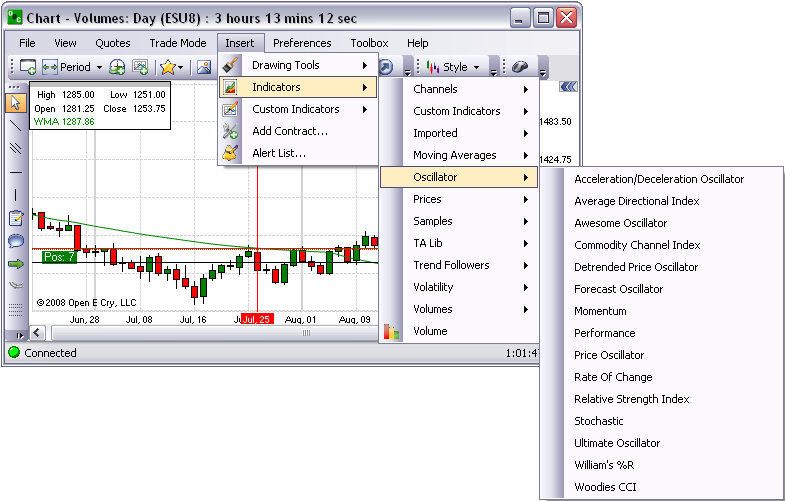
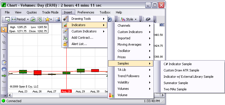
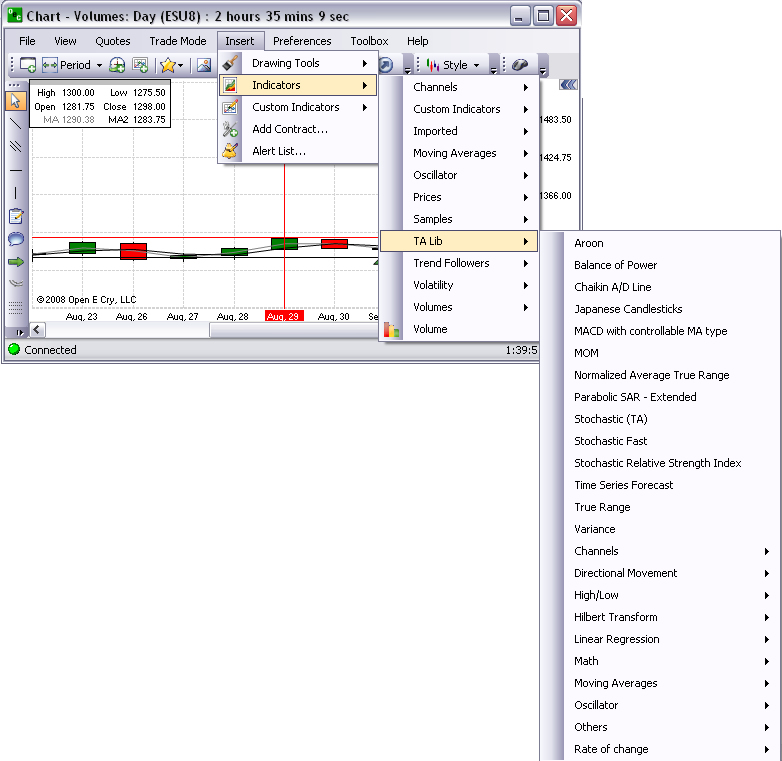
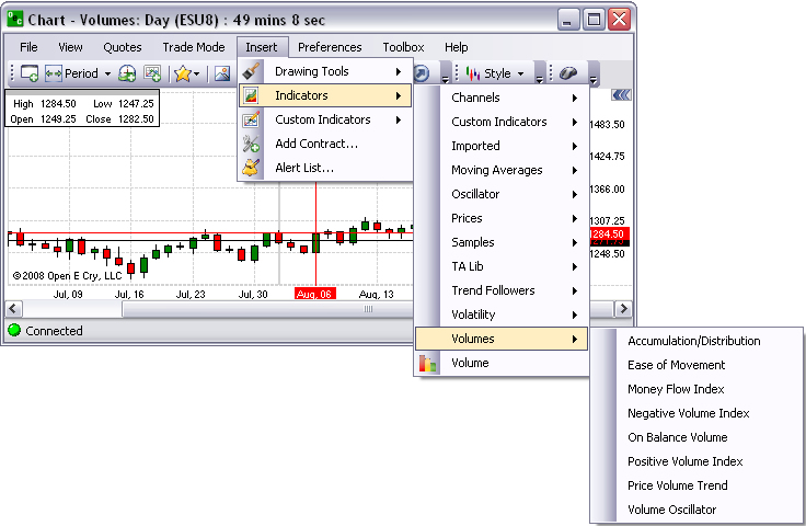
Indicators
The Insert command that displays the drop-down menu for the various types of indicators that is available in OEC Trader. There is an example display for each graphic for each indicator. The format preferences for indicators can be easily customized and this is specifically addressed in the section Preferences of this document.
Note: Refer to the website for detailed information on Custom Indicators at https://www.gainfutures.com/wp-content/uploads/CustomIndicators.pdf.
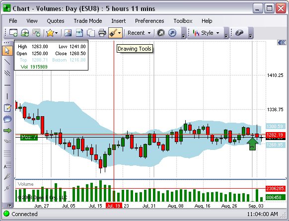
Channels
This refers to a group of custom indicators that are used in charts for technical analysis.
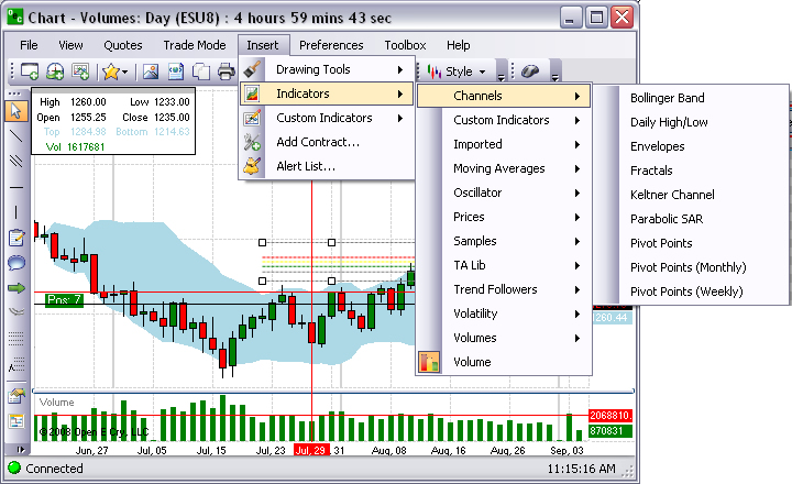
Note: All the examples for channel charts are displayed in the Candlestick style.
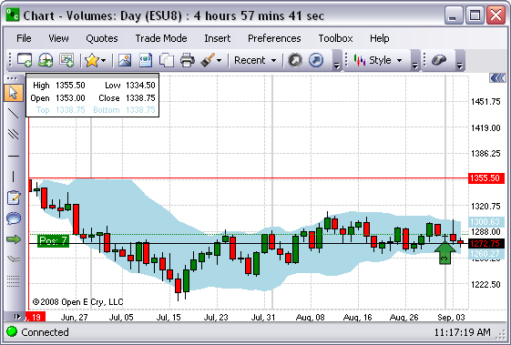
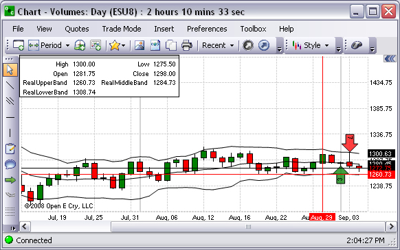
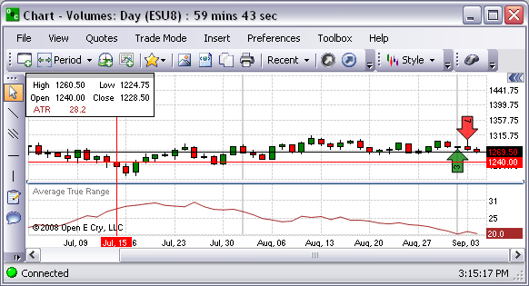
Bollinger Band
This is a graphic representation that displays a band plotted as two standard deviations away from a simple moving average. Refer to the Figure below.
Daily High/Low
This is a graphic representation that displays the high and low closing prices for a day. Refer to the Figure below.
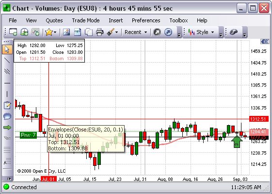
Envelopes
This is a graphic representation of a technical indicator that is formed with two moving averages one of which is shifted upward and another one is shifted downward. Refer to the Figure below.
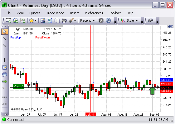
Fractals
This is a graphical presentation that is a suitable magnification of a part of one sample so it can be matched closely with some member of the ensemble. Refer to the Figure below.
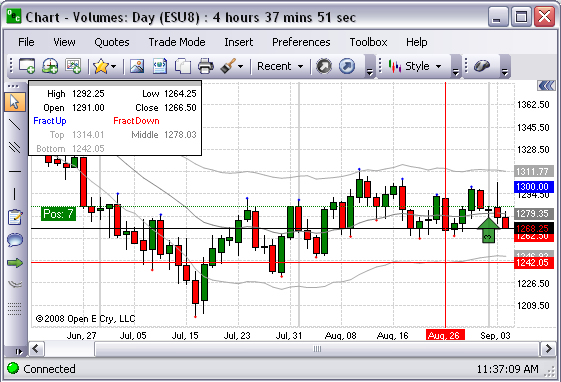
Keltner Channel
This is a graphic representation that is a volatility based 'envelope' indicator that measures the movement of commodities in relation to an upper and lower moving-average band. Refer to the Figure below.
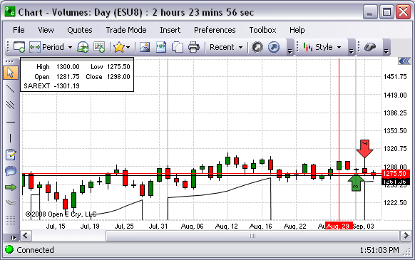
Parabolic SAR
This is a graphical representation used to find trends in market prices or commodities and may be also used as a trailing stop loss based on prices tending to stay within a parabolic curve during a strong trend. Refer to the Figure below.
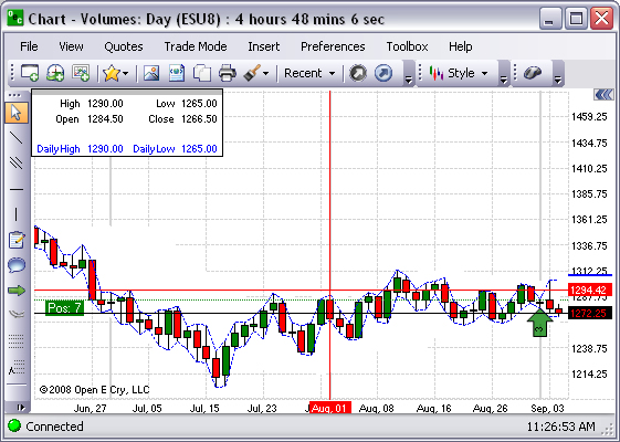
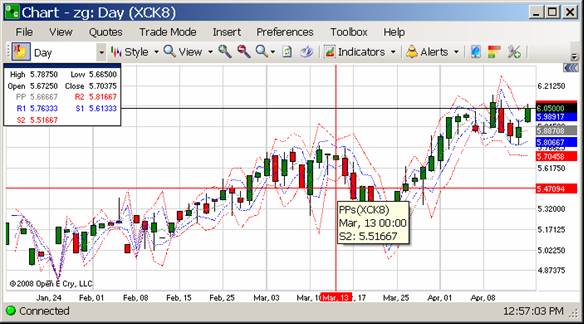
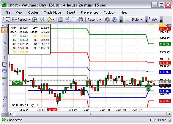
Pivot Points
This is a graphical representation that displays data in colorized designated incremental units. Refer to the Figure below.
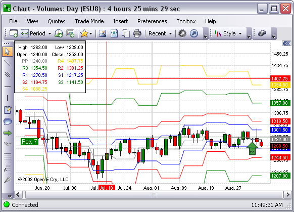
Pivot Points (Monthly)
This is a graphical representation that displays data in colorized designated incremental units only for a month. Refer to the Figure below.
Pivot Points (Weekly)
This is a graphical representation that displays data in colorized designated incremental units only for a week. Refer to the Figure below.
Custom Indicators
These are the tools to modify the chart properties in the display.
Note: Refer to the website for detailed information on Custom Indicators at https://www.gainfutures.com/wp-content/uploads/CustomIndicators.pdf.
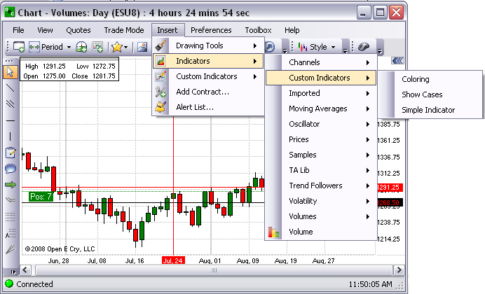
Imported
These are tools that have been uploaded to OEC Trader to modify the chart properties.
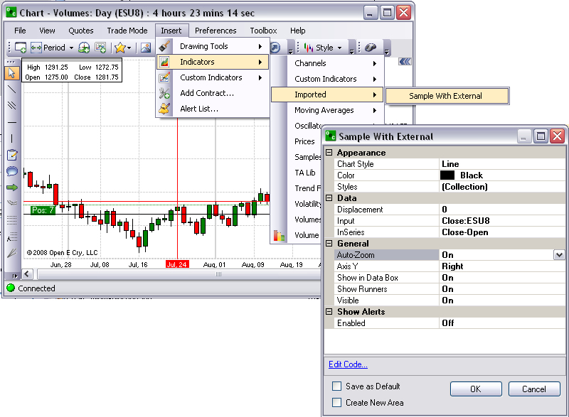
Under Insert, select Indicators, Imported, and Sample with External to display the indicators window.
Or, under Insert, select Custom Indicators, Imported and Sample with External. Refer to the Figures below.
Sample with External
Note: Refer to the website for detailed information on Custom Indicators at http://www.gainfutures.com/wp-content/uploads/CustomIndicators.pdf.
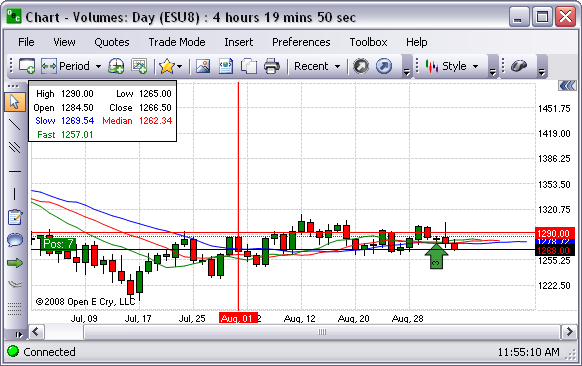
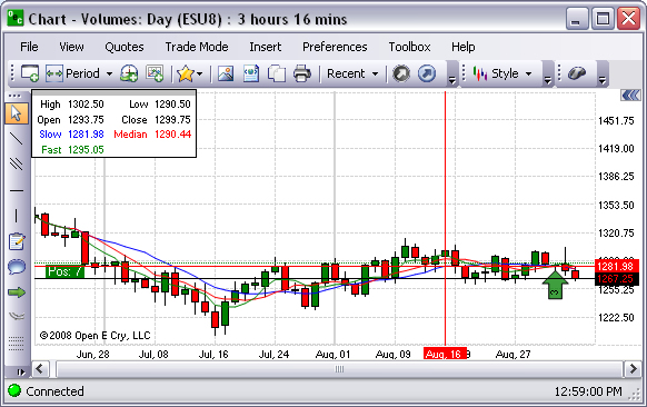
Moving Averages
These indicators are frequently used in technical analysis to show the average value of a commodity's price over a set period. Moving averages are generally used to measure momentum and define areas of possible support and resistance. Refer to the Figure below for the selections that are available in OEC Trader.
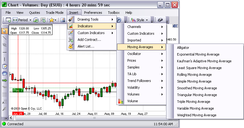
Note: All the examples for the Moving Averages indicators are displayed in the Range chart style.
This is a graphical representation of a combination
of Balance Lines (Moving Averages) that use fractal geometry and nonlinear
dynamics. Refer to the Figure below.
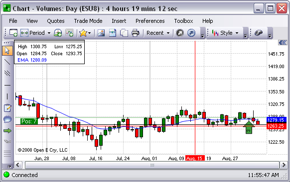
Exponential Moving Average
This indicator adds the moving average of a certain share of the current closing price to the previous value. In particular, the weighting for each older data point decreases exponentially, giving much more importance to recent observations while still not discarding older observations entirely. Refer to the Figure below.
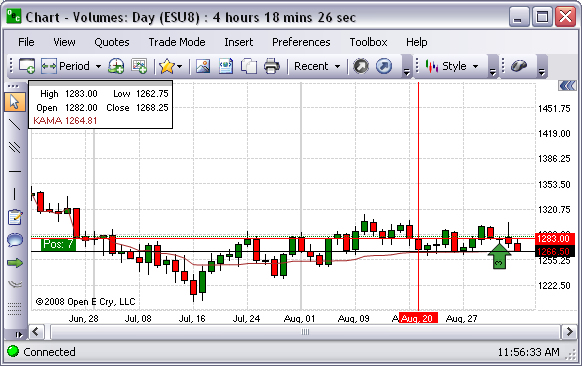
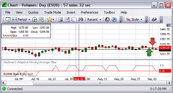
Kaufman’s Adaptive Moving Average
This indicator is a graphical representation of an EMA using an Efficiency Ratio to modify the smoothing constant, which ranges from a minimum of Fast Length to a maximum of Slow Length. Refer to the Figure below.
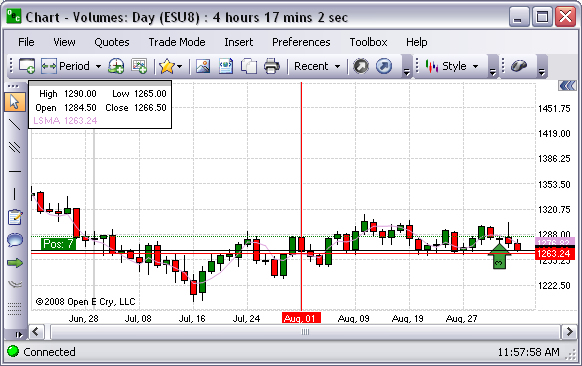
Least Square Moving Average
This is a graphical representation of a measure of the dispersion or variation in a distribution, equal to the square root of the arithmetic mean of the squares of the deviations from the arithmetic mean. Refer to the Figure below.
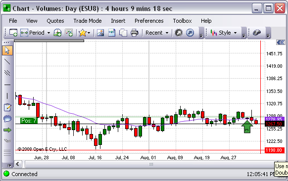
This is a graphical representation that is used to analyze time series data. It is also known as a Moving Average.
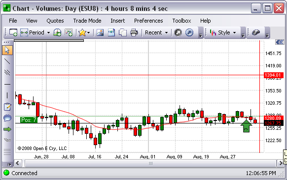
Simple Moving Average
This is a graphical representation of an arithmetical moving average is calculated by summing up the prices of instrument closure over a certain number of single periods (for instance, 12 hours). This value is then divided by the number of such periods.
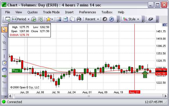
Smoothed Moving Average
Refer to the Figure below.
Triangular Moving Average
The Triangular Moving Average is a form of Weighted Moving Average wherein the weights are assigned in a triangular pattern. This gives more weight to the middle of the time series and less weight to the oldest and newest data. Refer to the Figure below.
Triple Moving Average
This is a graphical representation that identifies three different moving averages. Refer to the Figure below.
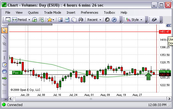
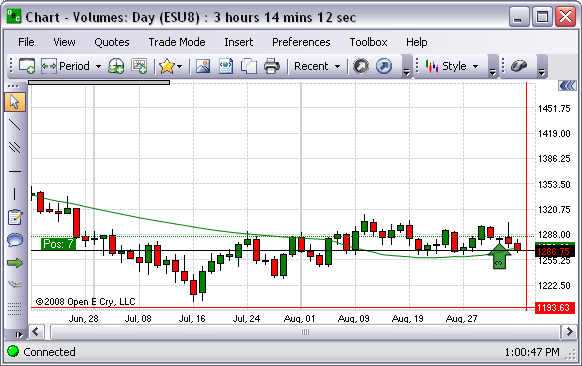
Variable Moving Average
A Variable Moving Average is an exponential moving average that automatically adjusts the smoothing weight based on the volatility of the data series. The more volatile the data, the more weight is given to the more recent values.
Weighted Moving Average
This is a graphical representation of a type of moving average that assigns a higher weighting to recent price data than does the common simple moving average. This average is calculated by taking each of the closing prices over a given time period and multiplying them by its certain position in the data series. Once the position of the time periods have been accounted for they are summed together and divided by the sum of the number of time periods. Refer to the Figure below.
Oscillator
The Oscillator function calculates the difference between two data series. It is a generic function that can take any price or indicator data as input. The available oscillator indicators are listed below in the Figure.
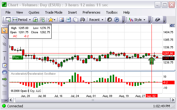
Acceleration/Deceleration Oscillator
This is a graphical representation that measures acceleration and deceleration of the current driving force. This indicator changes direction before any changes in the driving force, which, it its turn, changes its direction before the price. Refer to the Figure below.
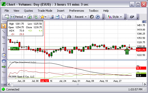
Average Directional Index
This is a graphical representation that determines if there is a price trend. The values range from 0 to 100, but rarely get above 60. To interpret the ADX, consider a high number to be a strong trend, and a low number, a weak trend. Refer to the Figure below.
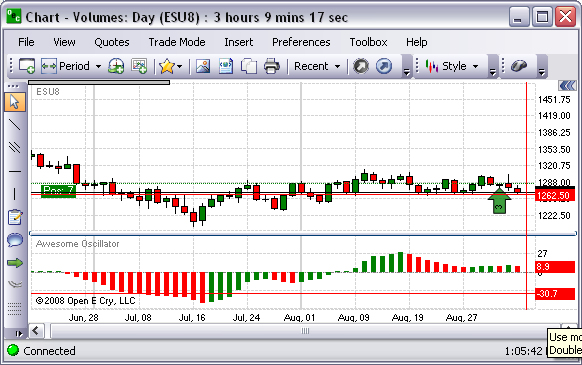
The Awesome Oscillator Indicator (AO) is a 34-period simple moving average, plotted through the middle points of the bars (H+L)/2, which is subtracted from the 5-period simple moving average, built across the central points of the bars (H+L)/2. It shows clearly what is happening to the market driving force at the present moment. Refer to the Figure below.
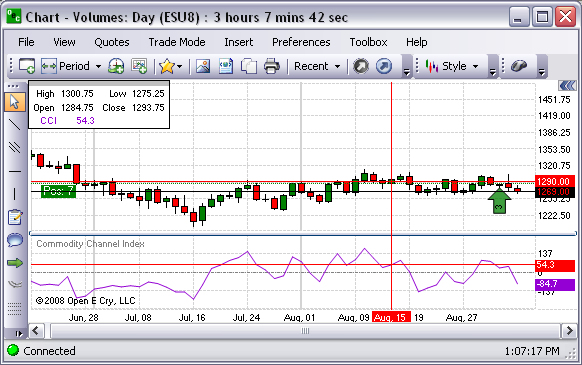
Commodity Channel Index
The CCI is designed to detect beginning and ending market trends. The range of 100 to -100 is the normal trading range. CCI values outside of this range indicate overbought or oversold conditions. Refer to the Figure below.
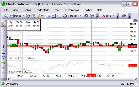
Detrended Price Oscillator
This is a graphical representation that eliminates the trend effect of price movement and it simplifies the process of finding out cycles and levels of outbidding/resale. Refer to the Figure below.
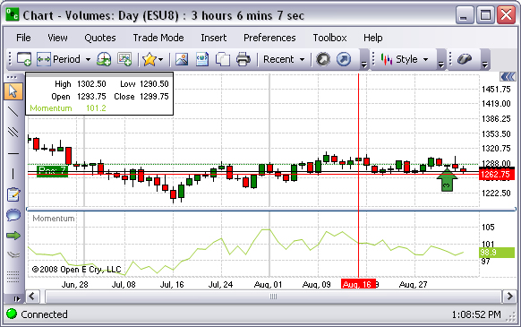
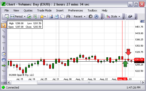
Momentum (MOM)
This is a graphical representation that measures the amount that a commodity’s price has changed over a given time span. Refer to the Figure below.
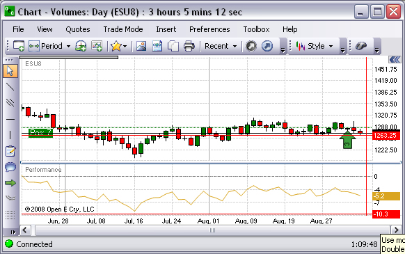
Performance
This is a graphical representation that displays the percentage difference between the price today and the price at the start of the data series. It is also known as a normalized price. It can be useful for comparing the performance of two commodities or a commodity and an index. Refer to the Figure below.
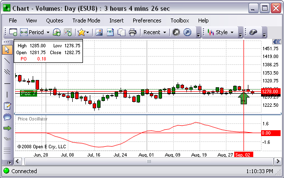
Price Oscillator
The Price Oscillator shows the difference between two moving averages. It is basically a MACD, but the Price Oscillator can use any time periods. A buy signal is generated when the Price Oscillator rises above zero and a sell signal is generated when it falls below zero. Refer to the Figure below.
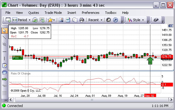
Rate of Change
The Rate of Change function measures rate of change relative to previous periods. The function is used to determine how rapidly the data is changing. The factor is usually 100, and is used merely to make the numbers easier to interpret or graph. The function can be used to measure the Rate of Change of any data series, such as price or another indicator. When used with the price, it is referred to as the Price Rate of Change, or PROC. Refer to the Figure below.
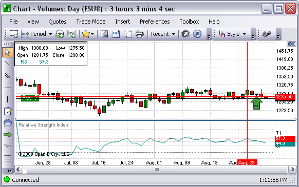
Relative Strength Index
This is a technical momentum indicator that compares the magnitude of recent gains to recent losses in an attempt to determine overbought and oversold conditions of an asset. Refer to the Figure below.
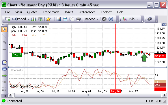
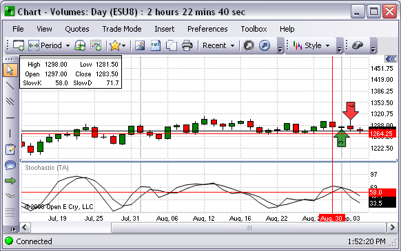
Stochastic
This oscillator finds trend reversal searching for a period when the close prices is close to the low price in an upward market of when the close prices is close to the high price in a downward market. Refer to the Figure below.
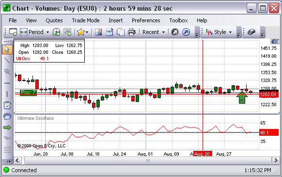
Ultimate Oscillator
The Ultimate Oscillator is the weighted sum of three oscillators of different time periods. The typical time periods are 7, 14 and 28. The values of the Ultimate Oscillator range from zero to 100. Values over 70 indicate overbought conditions, and values under 30 indicate oversold conditions. Refer to the Figure below.
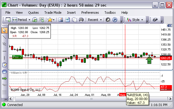
William’s %R
This is a momentum indicator measuring overbought and oversold levels, similar to a stochastic oscillator and compares a commodity's close to the high-low range over a certain period of time, usually 14 days. It is used to determine market entry and exit points. Refer to the Figure below.
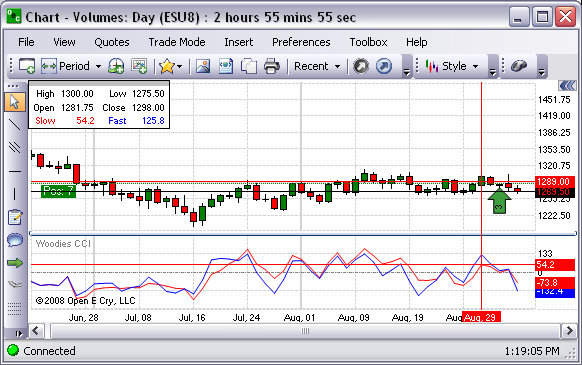
Woodie’s CCI
This is a graphical representation that identifies cyclical trends in . It is used to measure overbought and oversold levels. Refer to the Figure below.
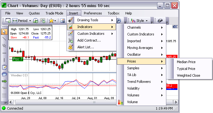
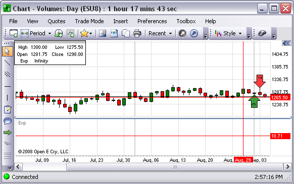
Prices
These are graphical presentations of indicators that identify price variables as the main factor.
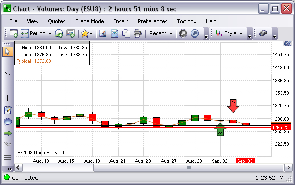
Typical Price
This is a graphical representation of the average value of daily prices.
Median Price
The Median Price is the average of the high + low of a bar. It is a graphical representation used to smooth an indicator that normally takes just the closing price as input.
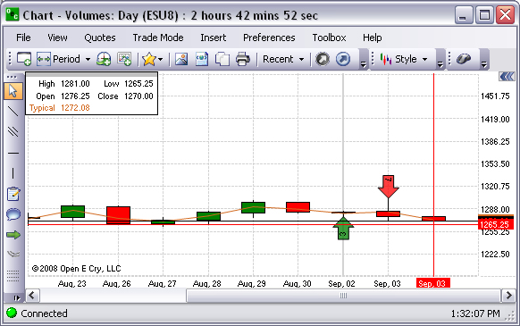
Weighted Close
The Weighted Close is the average of the high, low and close of a bar, but the close is weighted, actually counted twice. It is used in the calculation of several indicators. It is a graphical representation used to smooth an indicator that normally takes just the closing price as input. Refer to the Figure below.
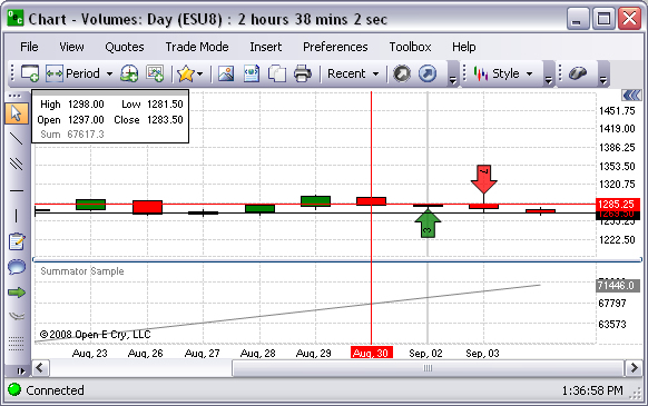
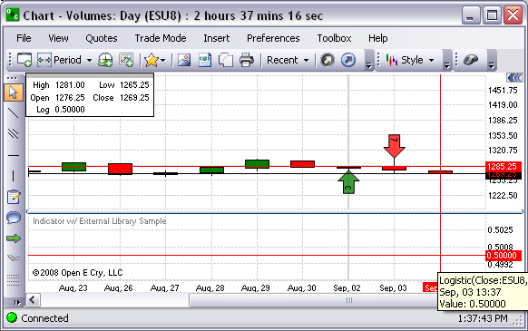
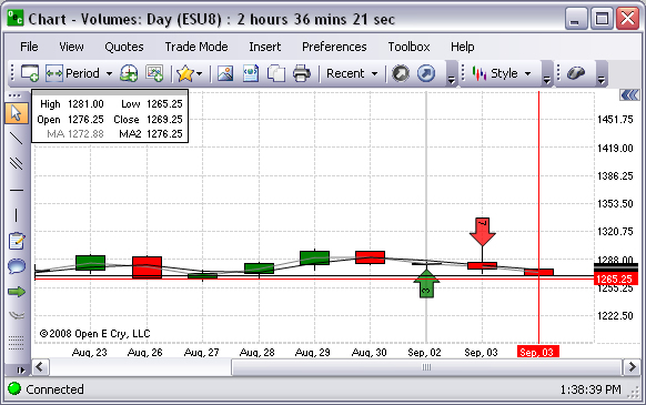
Samples
These are selected pre-set examples of chart settings that are available on OEC Trader.
C# Indicator

Custom Draw ATR Sample
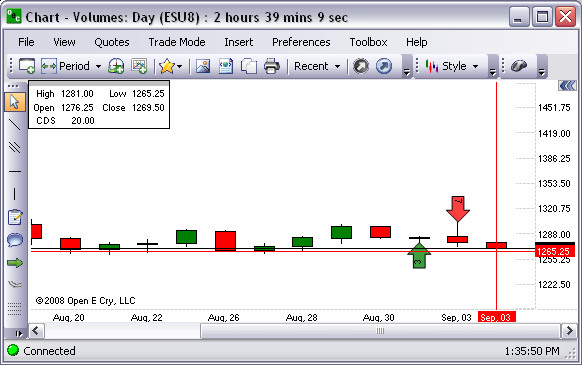
Summator Sample
Indicator with/External Library Sample
Two MAs Sample
TA Lib
The Technical Analysis (TA) Library of Indicators is an open-source software library of technical analysis indicators. This also is the charts command under Indicators that provides a drop-down menu of additional financial indicators that are available to use. Refer to the Figure below.
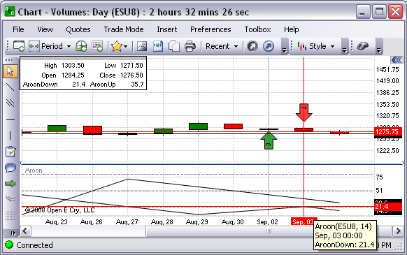
Aroon
The Aroon indicator attempts to show when a new trend is dawning. The indicator consists of two lines (Up and Down) that measure how long it has been since the highest high/lowest low has occurred within an n period range. Refer to the Figure below.
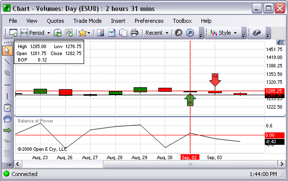
Balance of Power
This indicates whether the underlying action in the trading of a commodity is characterized by systematic buying (accumulation) or systematic selling (distribution). The single most definitive and valuable characteristic of BOP is a pronounced ability to contradict price movement. Refer to the Figure below.
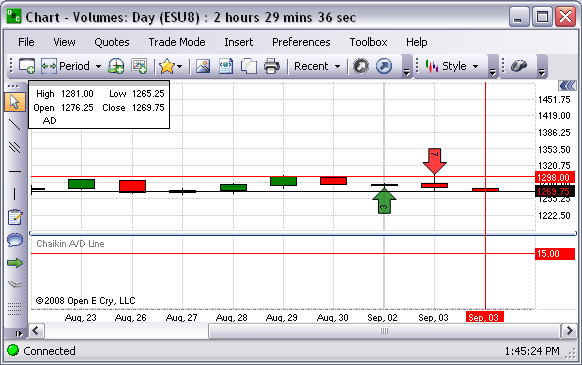
Chaikin A/D Line
The interpretation of the Chaikin Money Flow indicator (Chaikin A/D) is based on the assumption that market strength is usually accompanied by prices closing in the upper half of their daily range with increasing volume. Likewise, market weakness is usually accompanied by prices closing in the lower half of their daily range with increasing volume.* Refer to the Figure below.
Japanese Candlesticks
A candlestick chart is a style of bar-chart used primarily to describe price movements of commodity over time. Refer to the Figure below.
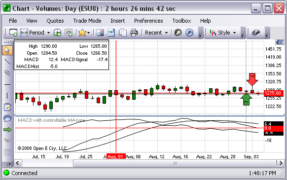
MACD with controllable MA type
Refer to the Figure below.
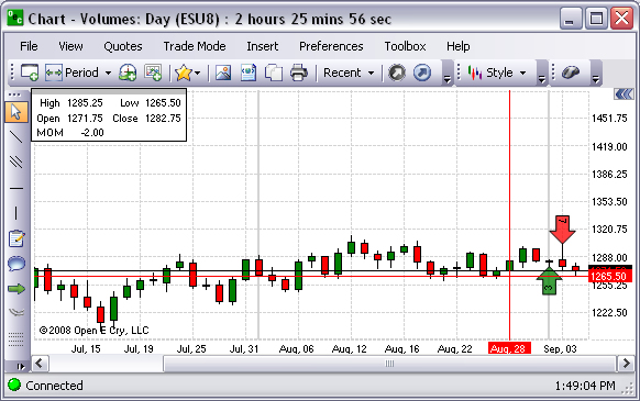
Momentum (MOM)
This is a graphical representation that measures the amount that a commodity’s price has changed over a given time span. Refer to the Figure below.
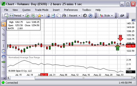
Normalized Average True Range
This is a graphical representation that measures commitment comparing the range between high, low, and close prices. Refer to the Figure below.
Parabolic SAR Extended
This chart is based on the stop and reverse principle over a period of time. When SAR first gives a buy or sell signal, its slope is relatively flat. However, the longer one is in a successful long trade, the more steeply the SAR dots rise. Eventually they take the shape of a parabola, rising at virtually a 90% angle until at some point price and SAR point meet.
Refer to the Figure below.
Stochastic (TA)
Stochastics is a momentum indicator and its value oscillates between 0 and 100. In an up market, Stochastics value increases towards 100 and conversely goes down in a down market. With the definition of upper and lower levels, overbought and oversold signals are generated when the indicator extends beyond these levels. Refer to the Figure below.
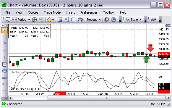
Stochastic Fast
A bearish stochastic crossover is when %D fast moves below %D slow. In contrast, bullish stochastic crossover is when %D fast moves above %D slow. Refer to the Figure below.
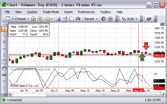
Stochastic Relative Strength Index
This is a Strochastic oscillator. Refer to the Figure below.
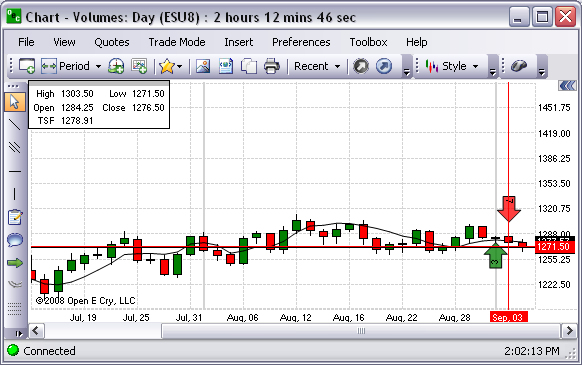
Time Series Forecast
This is a graphics representation that uses a method of forecasting which involves plotting a trend from the past to the present on a chart, making comparisons to other trends, and projecting it. Refer to the Figure below.
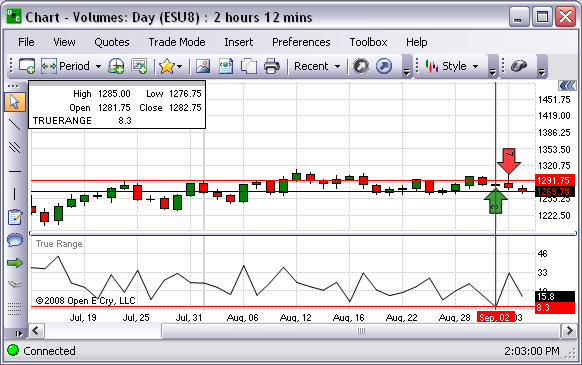
True Range
This is a graphic representation of a measure of volatility by taking a moving average of the greatest value of the following; 1) The distance between this period's high & low, 2) The distance from last period's close to this period's high or The distance from last period's close to this period's low. Refer to the Figure below.
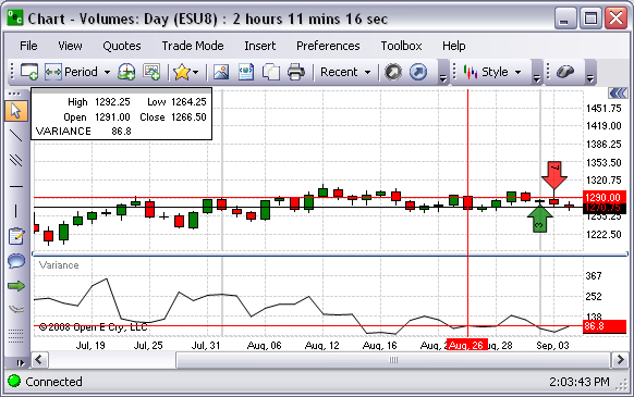
Variance
This is a graphic representation that displays the variance over time as well as their percentage deviation. Refer to the Figure below.
Channels
Bollinger Band
Bollinger Bands Technical Indicator (BB) is similar to Envelopes. The only difference is that the bands of Envelopes are plotted a fixed distance (%) away from the moving average, while the Bollinger Bands are plotted a certain number of standard deviations away from it. Refer to the Figure Bollinger Bands below.
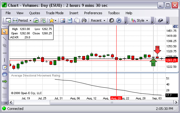
Average Directional Movement Rating
This is a technical analysis indicator that describes when a market is trending or not trending. Refer to the Figure below.
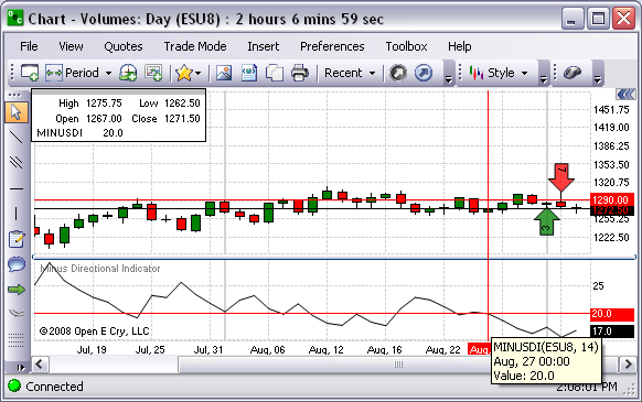
Minus Directional Indicator
This chart determines the momentum of negative changes. Refer to the Figure below.
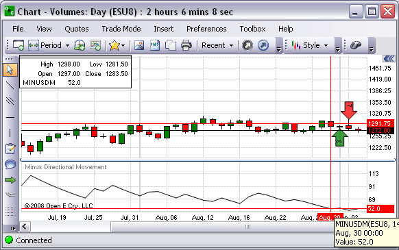
Minus Directional Movement
Refer to the Figure below.
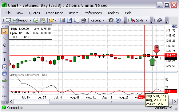
Directional Movement Rating
Refer to the Figure below.
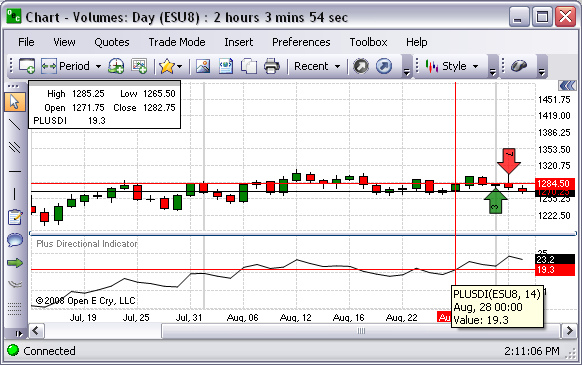
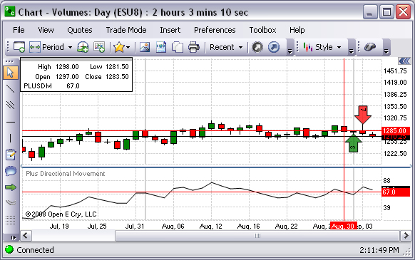
Plus Directional Indicator
This chart determines the momentum of positive changes. Refer to the Figure below.
Plus Directional Movement
Refer to the Figure below.
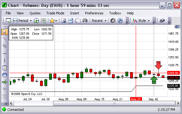
High/Low –Highest Value
Refer to the Figure below.
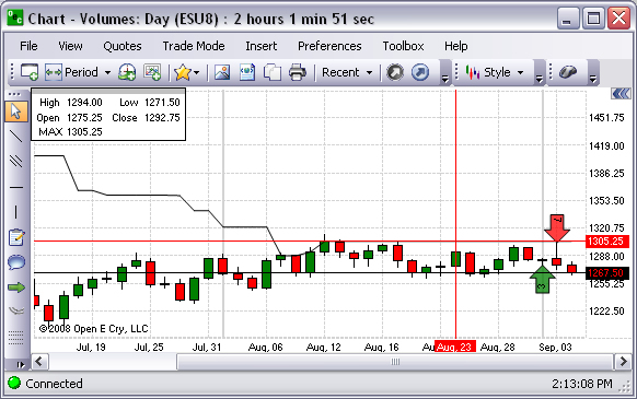
High/Low-Lowest and Highest Values
Refer to the Figure below.
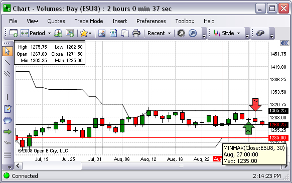
High/Low-Lowest Value
Refer to the Figure below.
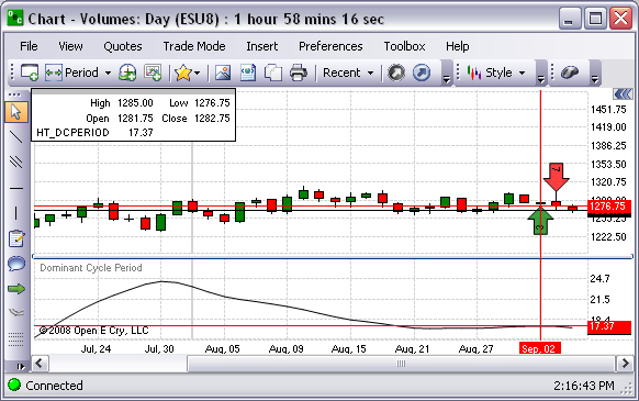
Hilbert Transform-Dominant Cycle Period
Refer to the Figure below.
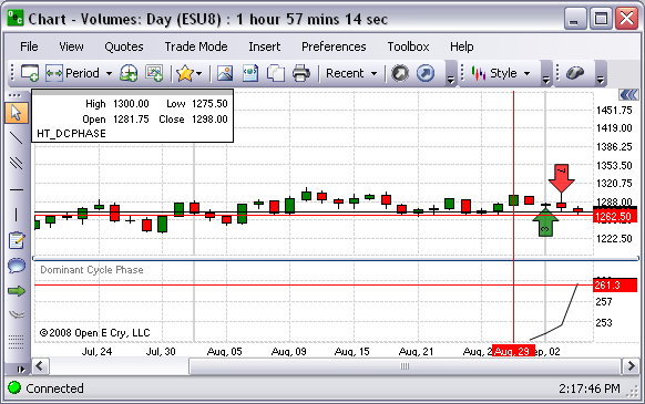
Hilbert Transform-Dominant Cycle Phase
Refer to the Figure below.
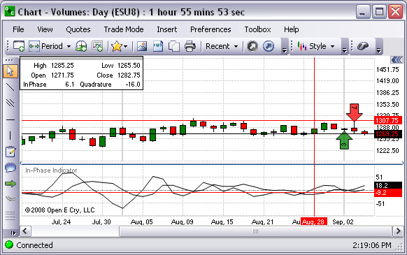
Hilbert Transform-In Phase Indicator
Refer to the Figure below.
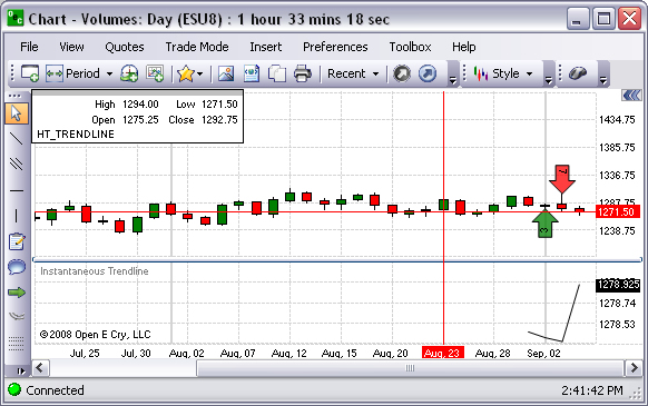
Hilbert Transform-Instantaneous Trendline
Refer to the Figure below.
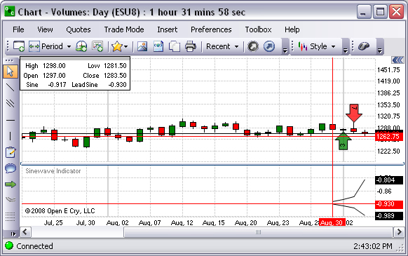
Hilbert Transform-Sinewave Indicator
Refer to the Figure below.
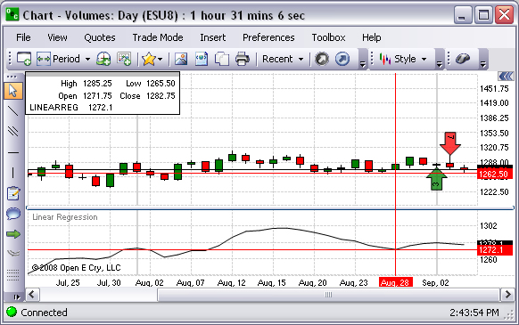
Linear Regression-Linear Regression
Refer to the Figure below.
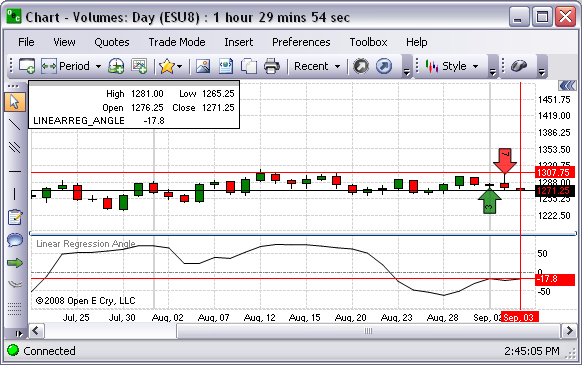
Linear Regression-Linear Regression Angle
Refer to the Figure below.
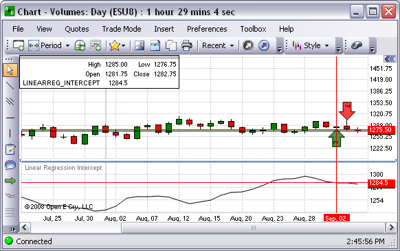
Linear Regression-Linear Regression Intercept
Refer to the Figure below.
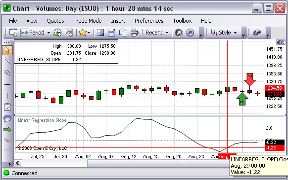
Linear Regression- Linear Regression Slope
Refer to the Figure below.
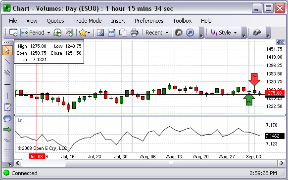
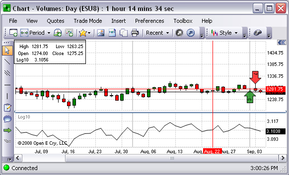
Math
This is the group of indicators based on specific formulas. Refer to the selection below.
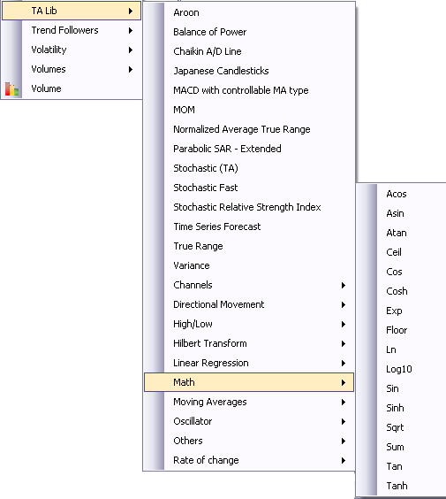
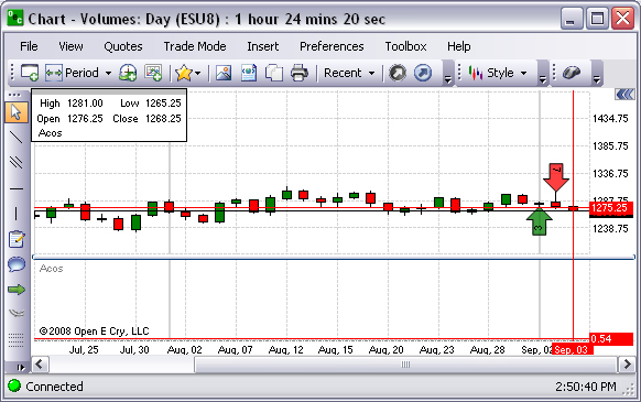
Math-Acos
Refer to the Figure below.
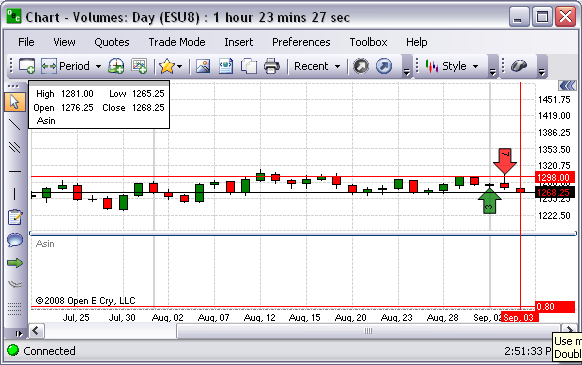
Math-Asin
Refer to the Figure below.
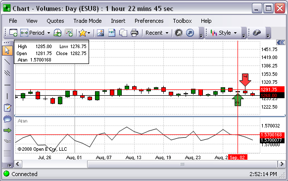
Math-Atan
Refer to the Figure below.
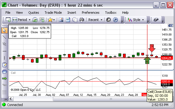
Math-Ceil
Refer to the Figure below.
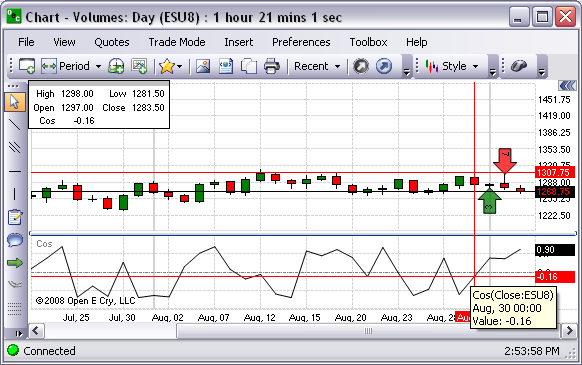
Math-Cos
Refer to the Figure below.
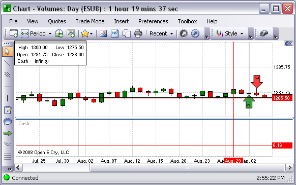
Math-Cosh
Refer to the Figure below.
Math-Exp
Refer to the Figure below.
Math-Floor
Refer to the Figure below.
Math-Ln
Refer to the Figure below.
Math-Log10
Refer to the Figure below.
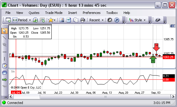
Math-Sin
Refer to the Figure below.
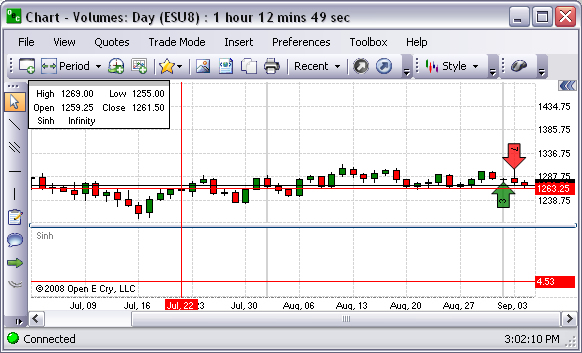
Math-Sinh
Refer to the Figure below.
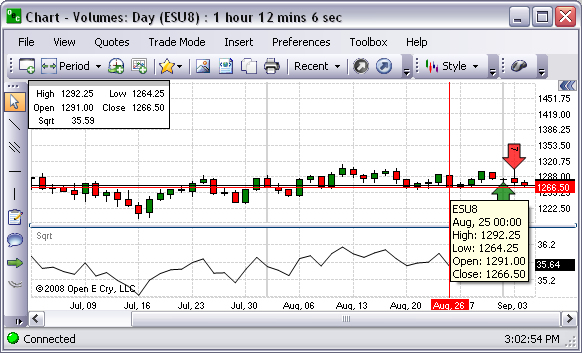
Math-Sqrt
Refer to the Figure below.
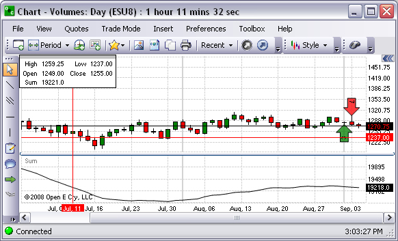
Math-Sum
Refer to the Figure below.
Math-Tan
Refer to the Figure below.
Math-Tanh
Refer to the Figure below.
Cross Reference - Refer to the Insert section of this document and select Moving Averages for details.
Oscillator
Cross Reference - Refer to the Insert section of this document and select Moving Averages for details.
Rate of Change
This refers to a momentum indicator is a speed of movement (or rate of change) indicator, that is designed to identify the speed (or strength) of a price movement.
Cross Reference - Refer to the Insert section of this document and select Oscillator for details.
Trend Followers
The submenu includes indicators that focus on the aspects of variables in the market over time. Refer to the Figure below.
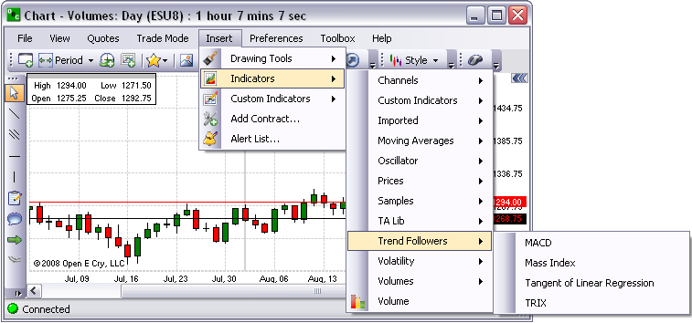
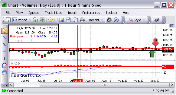
MACD
This graphical presentation compares two moving averages of prices and is used with a nine (9) day Exponential Moving average as the signal. Refer to the Figure below.
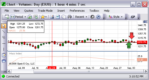
Mass Index (MI)
This graphical representation predicts trend reversal by comparing difference and range between high and low prices. Refer to the Figure below.
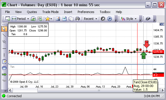
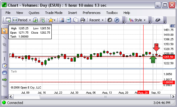
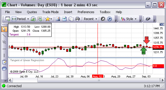
Tangent of Linear Regression (Tangent)
This graphical representation is presented in the Figure below.
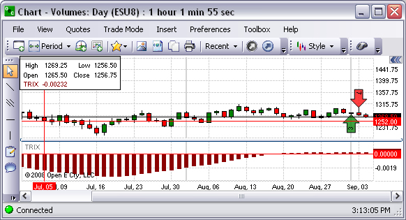
TRIX (TRIX)
This graphical representation is based on triple moving average of Closing Price and its purpose is to eliminate shorter cycles. Refer to the Figure below.
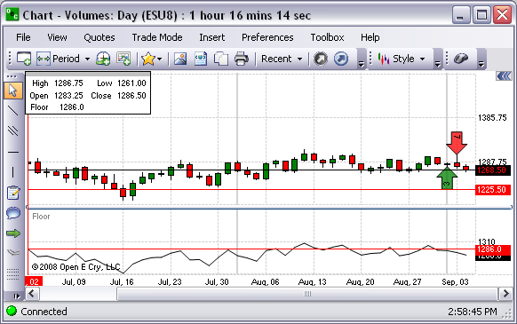
Volatility
This group of indicators focuses on volatility. Refer to the Figure below for the available selection on the drop-down menu.
To display a particular graphic for an open chart, select the item and click.
To remove the graphic from the chart, right click on the graphic in the chart, and click on Remove from the Chart Properties window.
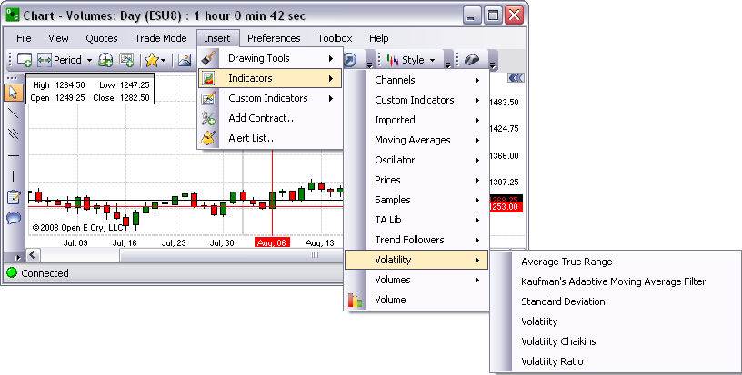
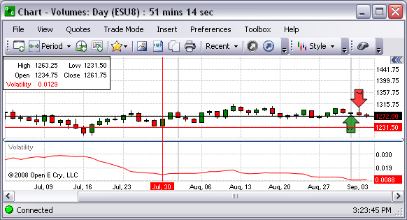
Volatility-Average True Range
Refer to the Figure below.
Volatility-Kaufman’s Adaptive Moving Average Filter
Refer to the Figure below.
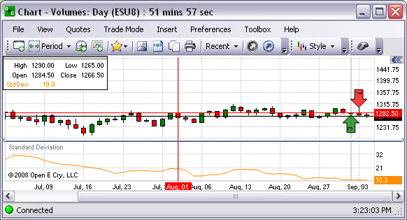
Volatility-Standard Deviation
Refer to the Figure below.
Volatility
Refer to the Figure below.
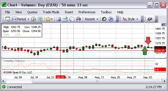
Volatility Chaikins
Refer to the Figure below.
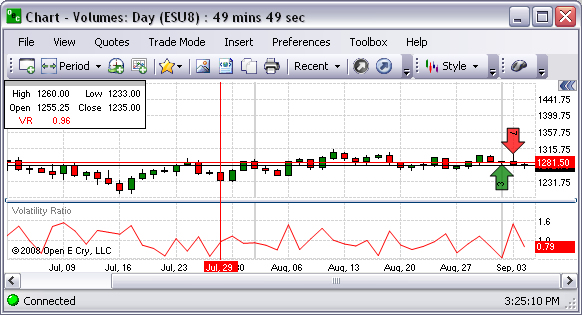
Volatility Ratio
Refer to the Figure below.
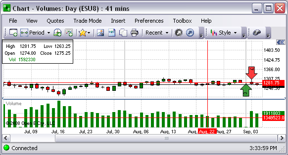
Volumes
These are charts based upon volume make a new price bar (or candlestick, line, etc.) every time a specific number of contracts have been traded. This is the group of indicators on the drop-down menu group menu. Refer to the Figure below.
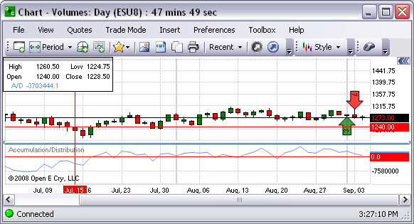
Accumulation/Distribution
Accumulation/Distribution Technical Indicator is determined by the changes in price and volume. The volume acts as a weighting coefficient at the change of price — the higher the coefficient (the volume) is, the greater the contribution of the price change (for this period of time) will be in the value of the indicator. Refer to the Figure below.
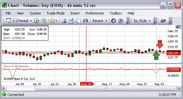
Ease of Movement
This is a technical momentum indicator that is used to illustrate the relationship between the rate of an asset's price change and its volume. Refer to the Figure below.
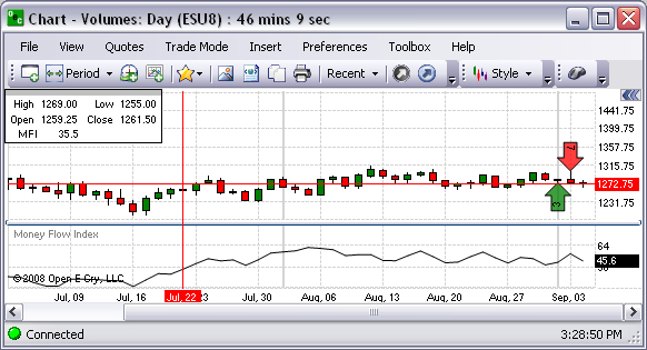
Money Flow Index
This is a momentum indicator that is used to determine the conviction in a current trend by analyzing the price and volume of a given commodity. The MFI is used as a measure of the strength of money going in and out of a commodity and can be used to predict a trend reversal. Refer to the Figure below.
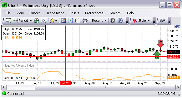
Negative Volume Index
This is an index that tries to determine what experienced investors are doing by looking at days where trading volume has decreased from the previous day, under the belief that unusually high volume is a sign that inexperienced investors are moving the markets. Refer to the Figure below.
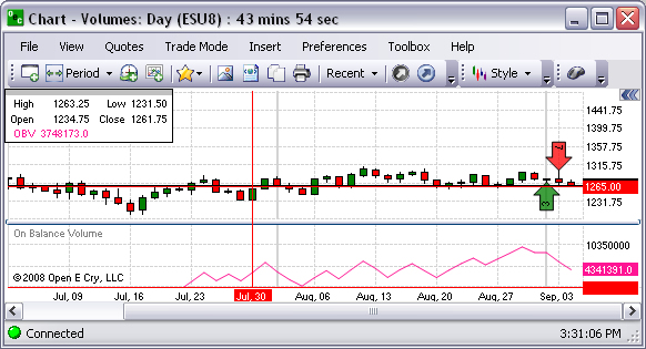
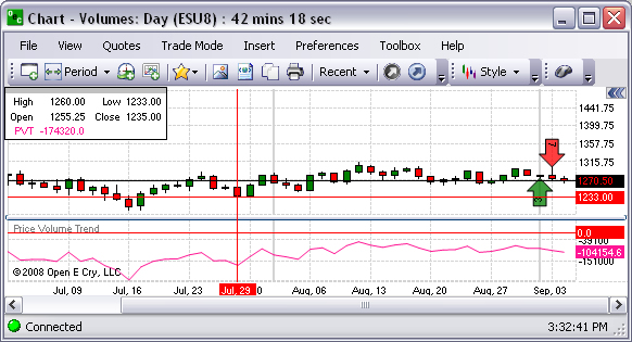
On Balance Volume
On Balance Volume Technical Indicator (OBV) is a momentum technical indicator that relates volume to price change. When the commodity closes higher than the previous close, all of the day’s volume is considered up-volume. When the commodity closes lower than the previous close, all of the day’s volume is considered down-volume. Refer to the Figure below.
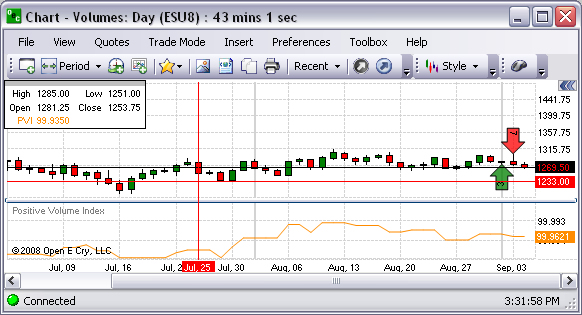
Positive Volume Index
This is an index that focuses on days where the volume has significantly increased from the previous day's trading. It tries to determine what smart investors are doing. When trading volume is high it is thought that inexperienced investors are involved. Consequently, on slow days, "shrewd investors" quietly buy or sell the commodity. Refer to the Figure below.
Refer to the Figure below.
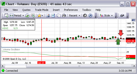
Volume Oscillator
This is a graphical representation of a volume oscillator intended to compare moving averages of varying time periods to compare volumes. Refer to the Figure below.
Volume Histogram
This command displays a graphical representation that organizes a group of data points into user-specified ranges based on volume. In the Figure below the histogram displays the information on the open candlestick chart as bar columns.
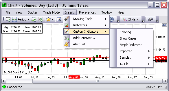
Custom Indicators
This Insert command displays the drop-down menu for the various types of indicators that can be customized. Refer to the Figures below.
To select a specific indicator from here, click on Insert, select on Custom Indicators and click on the item to display the Indicator window.
Refer to the Simple Indicator example in the lower Figure.
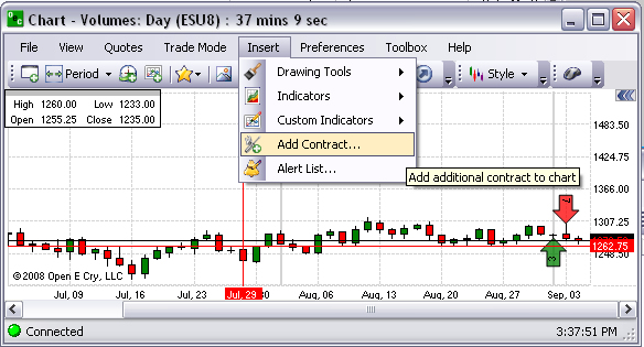
Add Contract
This Insert command displays the Add New Contract window. Refer to the Figures below.
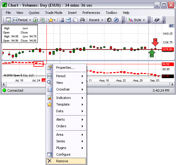
To display a new contract in the current open chart at the bottom, select an item from the drop-down menu, click on New Area and click Ok.
To remove the new contract, right-click on the object to display the Context Menu and click Remove. Refer to the Figures below.
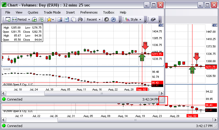
To resize the window with both charts, left click on the triangle in the lower right corner, hold and drag downward to the right to the desired size. Refer to the Figures below.
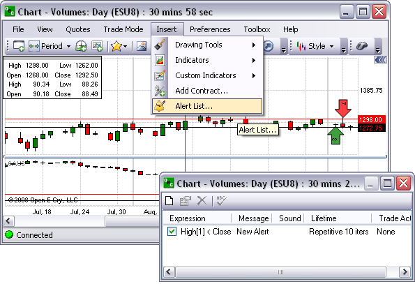
This Insert command displays the Chart Sound Alert window. Refer to the Figures below.
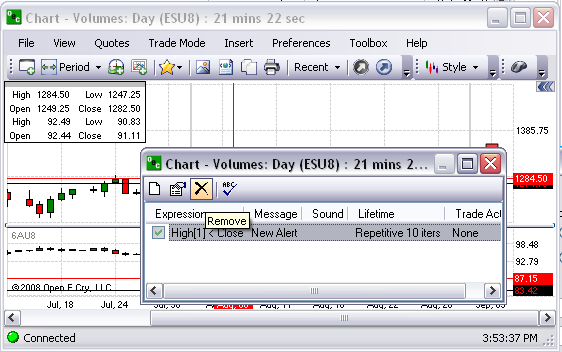
To view the list of alerts that are active, click on Insert and select Alert List to display the window.
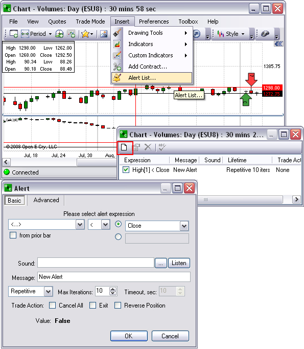
Add an Alert
To assign an alert, click on New (the first icon in the toolbar) to display the Alert window.
Make selections and click Ok.
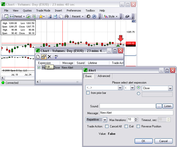
To edit an existing alert, in the chart window, click on the second icon to display the alert window.
Select the settings and click Ok.
Edit an Alert
To remove an alert, click on Insert and select Alert List.
Highlight the contract alert and click the Edit icon to display the Alert window. Refer to the Figures below.
Modify the settings and click Ok.
Remove an Alert
To remove an alert, click on Insert and select Alert List.
Highlight the contract alert and click the Remove icon. Refer to the Figures below.